I am Bodoni
2019
Typography, layout
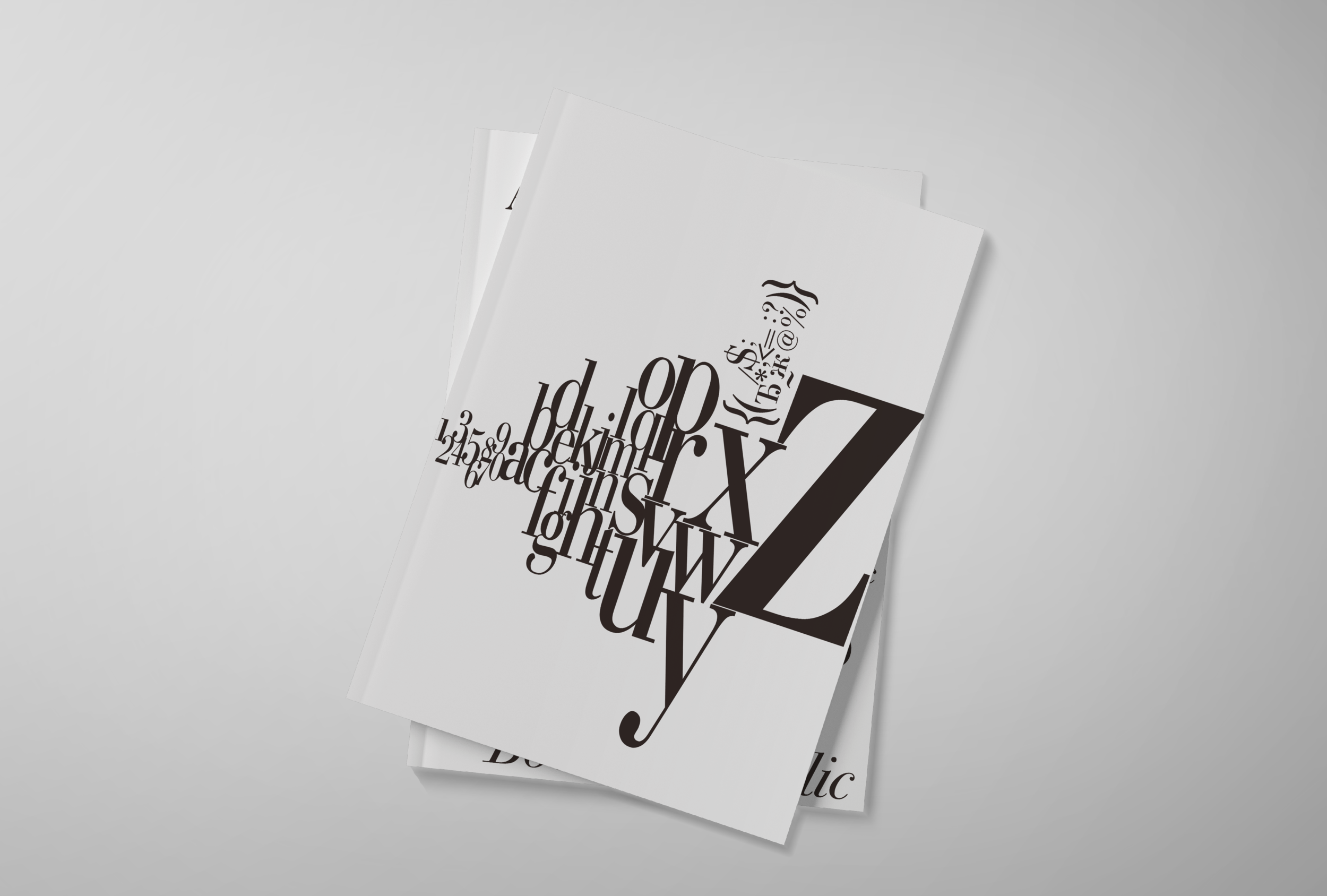
A simple project to create a magazine and graphical identity through the use of only one type.
Through playing with fonts, glyphs and hierarchy, a series of pages were created to highlight the unique characteristics of the typeface; Stark contrasts stroke weights and curved, elongated serifs.